Google Data Studio For Beginners with Kevin D’Aguiar was recorded at our SEO Brunch in November 2020
Kevin D’Aguiar is the principal consultant and owner of Matters of Data, an analytics consultancy that helps businesses tell data-driven stories. Passionate about data and digital marketing, D’Aguiar’s superpower is explaining complex information in simplified ways.
Download the template and follow-along with Kevin!
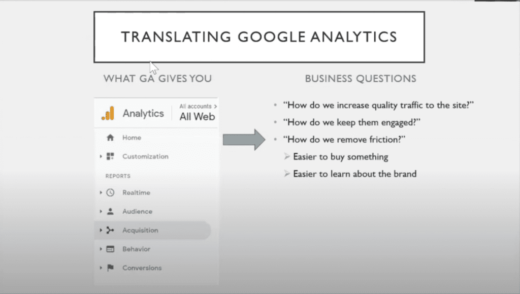
Whenever I do Google Data Studio training for clients, I like to start with this slide.
I find it helps with framing what you’re trying to do and separating what’s really important to the dashboard from what is ‘nice to have.’ There are many potentials, and you can pull in a tonne of metrics, but if it’s not tied to a business question, you might be wasting your time.
At the end of the day, you’re trying to translate what Google Analytics (and, by extension, Google Data Studio) offers you into answers to practical business questions. Questions like, ‘how do I get more people to my website?’ ‘How do I get them to stay?’ And, ultimately, ‘how do I get them to take the action I want?’ Essentially, with GDS, you’re trying to get closer to the answers to these questions.
In Google Analytics, your data gets split into three buckets.
Audience and acquisition reports typically talk about the different types of people coming to your website and can help you attract more people to your website. Behavior reports tell you how visitors behave, where they are going, and what they are clicking on or scrolling through. The third bucket is conversions; how many people are achieving the goal that you want on your website?
So how does that translate to a dashboard?
Typically, my starting point for most websites is creating three pages in my Google Data Studio dashboard based on the same three buckets as Google Analytics.
The first page is about the audience; the next page will cover content and where people visit. The third offers a breakdown of goals and engagements. I keep those three buckets in mind whenever starting with Google Data Studio dashboards.
Today I want to talk about a few cool things related to Google Data Studio.
If it seems intimidating, I think the easiest way to approach Google Data Studio is to treat it like a PowerPoint presentation. If you’re familiar with dragging and dropping images or text into PowerPoint, it’s not much of a leap to manipulate a Google Data Studio dashboard.
With a couple of clicks, you can add an image or a text box in PowerPoint. The real difference is the data being live or semi-live.
When you adjust the view in GDS, it’s querying Google Analytics live and displaying the results visually. So that’s one neat thing about GDS; it’s sort of a better version of PowerPoint.
The neat thing is there’s this view mode (or how an end-user would interact with a dashboard) and an edit mode. This malleability allows you to toggle back and forth between edit and view and make changes to the dashboard as you see fit. And, once you’re in edit mode, you can make changes to everything.
More on that a bit later. For now, I want to highlight another cool aspect of GDS. Even in view mode, it’s not necessarily static. GDS has these things called controls that allow you to manipulate the dashboard.
When you add controls, they give you the ability to play with numbers (even in view mode). Say you are more interested in the last week of data instead of the previous month. You can play with the date range, hit apply, and everything re-queries and pulls live data to update the numbers for you.
Controls don’t only apply to dates.
Let’s say you have a global dashboard for your whole website, but you were interested in organic. With a couple of clicks, you can make the lens of the entire dashboard only organic search. And it’s relatively easy to go back and forth and play with these controls.
Now, let’s talk about the actual dashboard content and why I have these particular charts in my dashboard template.
Building Your Google Data Studio Dashboard
For your particular website, you’re going to customize your GDS dashboard to your needs. The template is simply a high-level starting point to build off, so you’re not starting with a blank page.
Typically, I always start with traffic. So that at a glance, I can look at and see how things are going. I set up this dashboard to compare to the previous period. It also compares the numbers and shows whether things are going up or down relative to the last time frame (in this case, seven days).
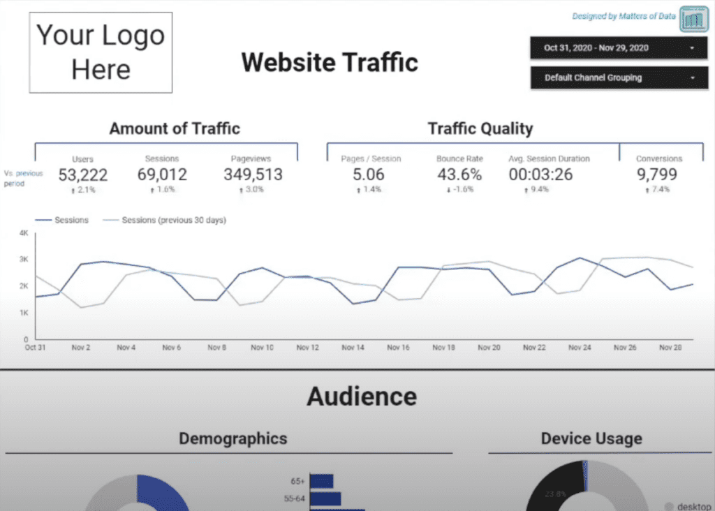
But you can also make it year over year, or you can customize your comparison period, so it’s relevant to your needs. You want to see how much traffic you have and if it’s up or down versus a previous period.
At a glance, you should be able to see things are green and looking up.
Now we get to the traffic quality (how engaged people are with your website).
Did engagement go up? Are people bouncing more often or less often? How long do people typically spend on your site, and how many visitors are taking the action you want? (Bounce rate measures how many visitors arrive on the website and leave without interacting in any other way.)
This page is a top-level view, a lay of the land. I also like to look at how things are going overtime.
What else goes on this first page? Typically, tools to help you find out more about the audience itself.
Google has all kinds of information around demographics and devices. You can even see how device usage evolves. Just pick a previous date range to compare to a recent one, and you can see the share of device usage changing over time.
So you can have that interactivity with the dashboard. It’s not necessarily something static.
When it comes to geography, the map is nice to look at, but I feel it is easier to digest in a table. Perhaps you use a heat map feature to see where the most popular areas are, geographically, for your web traffic. I like to have two different levels, one zoomed out regionally and one with a city focus, to decipher the importance of specific regions.
That’s the first page. Now we move on to content.
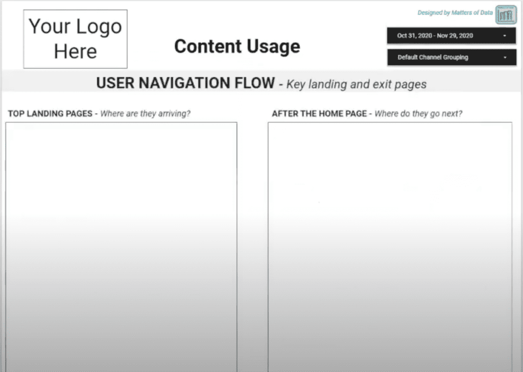
Again, as a starting point, I like to consider four questions that help describe how people navigate your website.
- When they arrive, what’s the first page they see?
- Where do they go next?
Google Analytics, historically hasn’t been very good at tracking flow. So, coming up with a way to uncover flow was the only way to go.
I won’t get into Google Analytics 4, as it’s a whole other thing. But there’s a new evolution of Google Analytics trying to tackle that. They’re creating more interactive reports within Google Analytics where you can see the flow of behavior, not only within pages but actual clicks getting from point A to point B.
But, for now, the story is, where do they land? Where do they go next?
- What are the most popular pages on my website, overall?
And, and this one is always interesting.
- What’s the last page that they see?
Are there any issues to be addressed? If you notice people seem to be getting stuck on a particular page and then leave your website, these four questions can help start your journey in figuring out the flow of how people are interacting with your website.
And finally, we come to Traffic Source Breakdown.
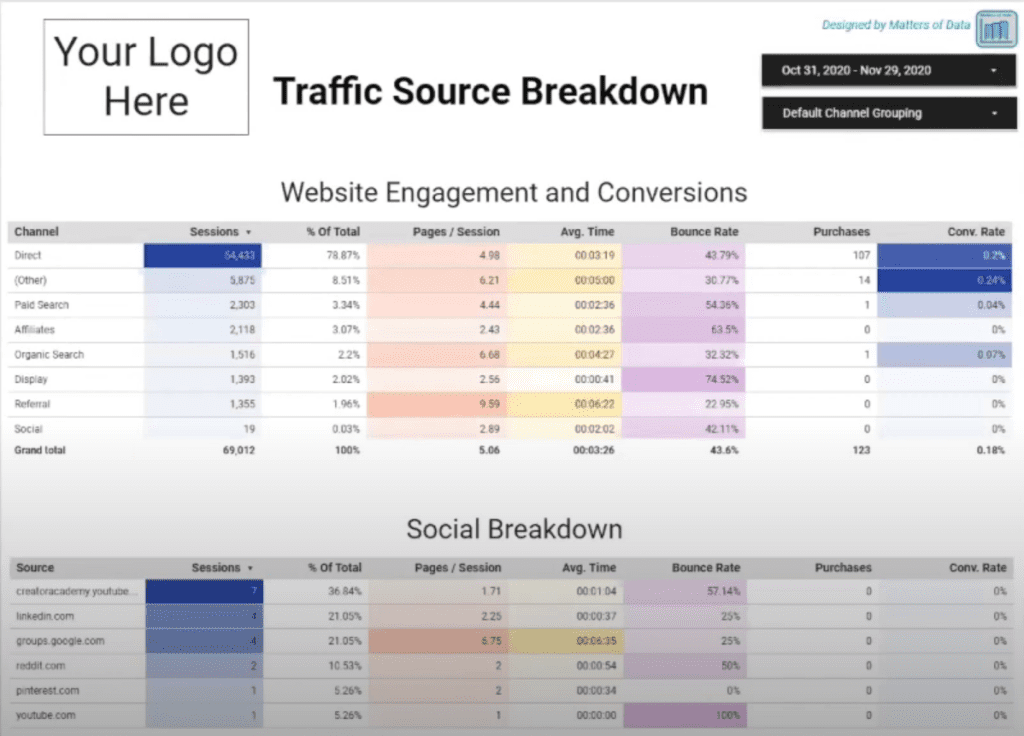
With this, I’m trying to bring conversions and goals into the dashboard template. But also overlay it with a segmenting of the traffic.
You want to know how many people are converting and whether that number is up or down. You also want to know which channels convert the most or the least and identify opportunities.
This first table can let you know, by channel, the conversion rates and whether you know which channels seem to be fighting above their weights relative to other channels. And you can use that information to decide how you want to approach the other channels, even those that are succeeding.
Now, Google Analytics groups all social networks into one, but you can break that chart down further and separate social and referral, as well. This segmentation offers a focused view of where your traffic originates, how your visitors engage, and how many convert. From there, you can decide what to do from a content standpoint.
Getting Started
Now let’s look at how to get started with Google Data Studio.
If you’re ever interested in trying it with your data and want to use this template, you just need to make a copy by clicking on the two squares in the top right-hand corner. But, instead of pointing to the sample Google Analytics data, you connect to your data. Just click ‘create new,’ select your data source, and all data refreshes automatically.
You don’t have to do anything else besides point to the new data source. Your results will look identical but are based on your data instead of Google Analytics’ sample data.
The first step is making that copy.
Next, let’s try to add a chart to this dashboard.
I feel like a page is a little incomplete. Not only should we see how many users right off the bat, but that channel breakdown should be on the first page.
If we want to make room, select the existing charts and make them smaller. This adjustment will free up space for the new table.
When it comes to adding things, use the toolbar at the top. If you want to add text, use the letter A. If you want to add an image, you can upload it. Again, it’s just like PowerPoint. But if it’s a chart you want to add, it gives you all these visualizations. You just click ‘add chart,’ and you can choose.
Say we add a table. GDS creates a table with default numbers to match your dashboard that you can modify to your preferences.
But what if you want to track how breakdown by channel?
Under the ‘Data’ tab on the right side, you’ll see ‘Dimension.’ There, you select Default Channel Grouping and get rid of the date. You can stick with users, but I prefer sessions. It’s a tomato tomahto thing. This chart will tell you how many from each channel are landing, and you can rename it as you see fit. (There’s an edit icon to the left).
Under the style tab (also on the right), you can make style changes. For instance, maybe you don’t see a need for row numbers, so you remove them. And at the bottom, there’s something called pagination you can remove to keep things cleaner.
Then just spread out the table as needed. Now you have a breakdown by channel.
That’s one quick example of how to add elements to your Google Data Studio dashboard. There’s a lot more to learn, but I wanted to make sure you had a starting point and an introduction to best practices. Hopefully, it will help get you started on your Google Data Studio journey.

